A Spectrum of Digital Displays
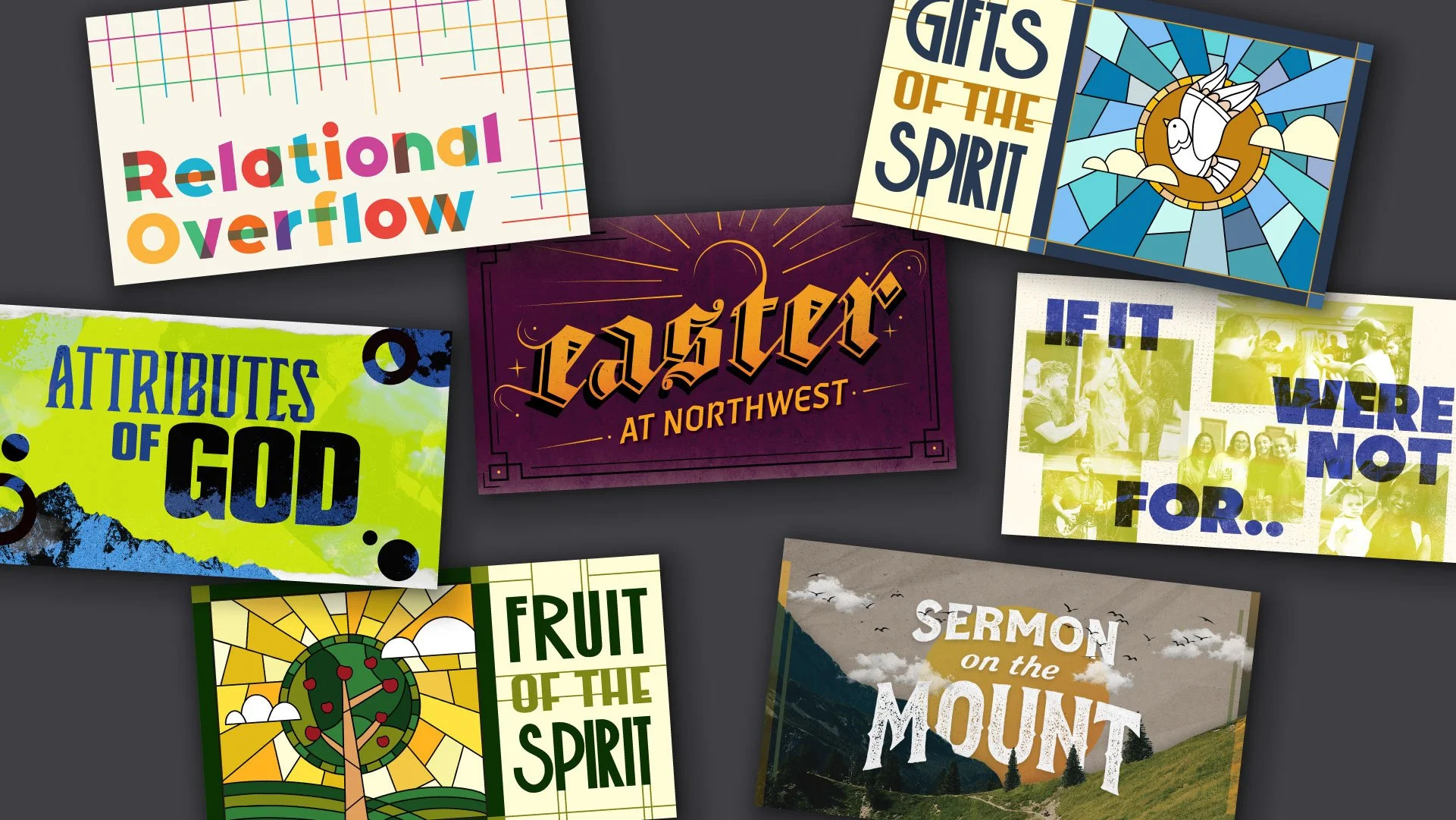
The idea: Church graphics often fall into repetitive, predictable patterns that fail to grab attention in a crowded digital space. When an organization produces lots of digital content on a weekly basis, the visuals can quickly become stale, making it difficult for individual messages to stand out or feel significant.
The Evolution: I approached this challenge as a visual experiment, with each graphic standing on its own. By intentionally rotating through different aesthetics, ranging from gritty, distressed textures to popping colors, I ensured that no two pieces felt alike. This fresh-start mindset keeps the work engaging, breaking away from predictable visual patterns. Each layout is custom-built to reflect its specific theme, showing that a consistent message doesn’t have to rely on a repetitive look.
DIGITAL DESIGN \ TYPOGRAPHY
ILLUSTRATION