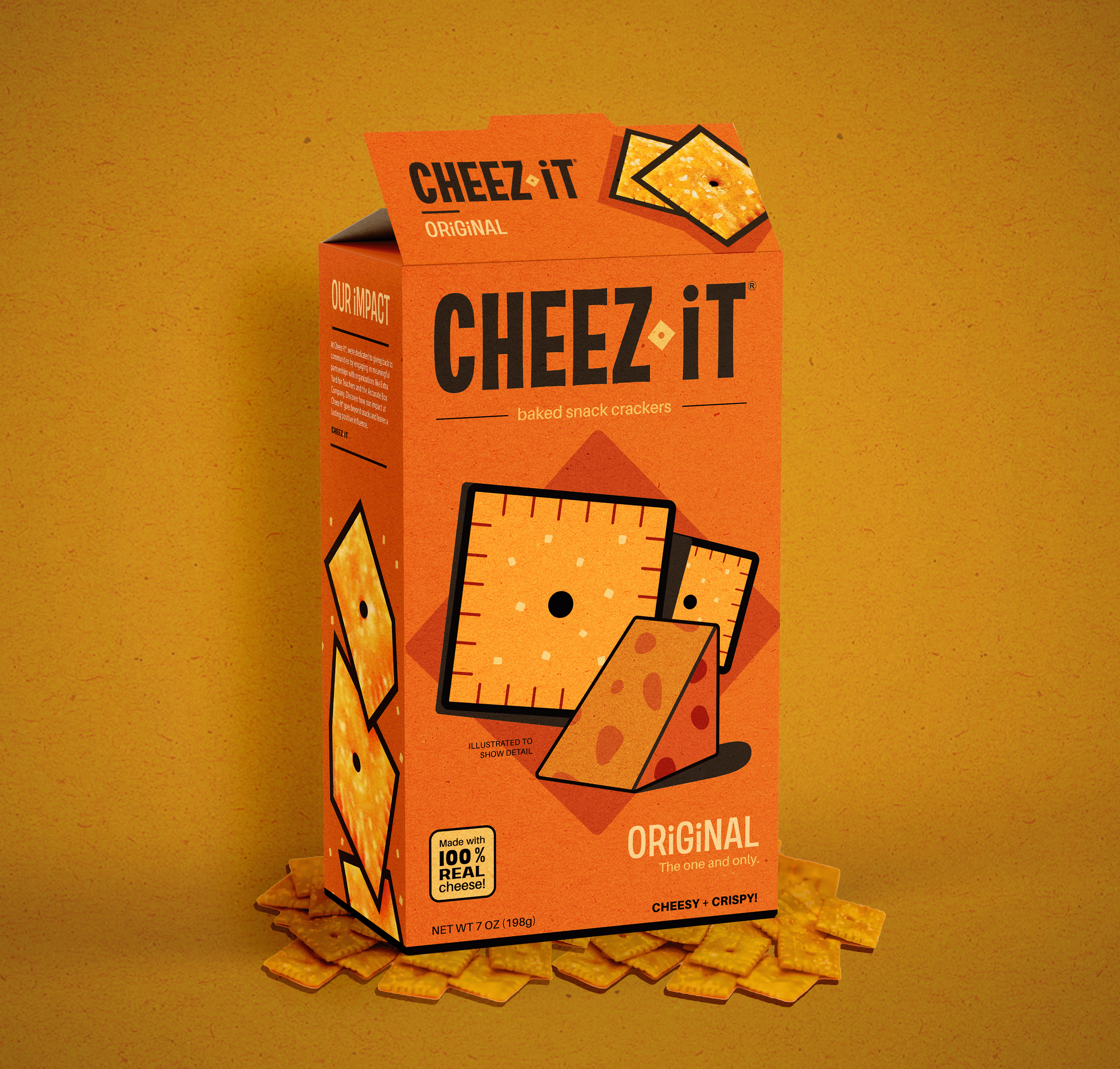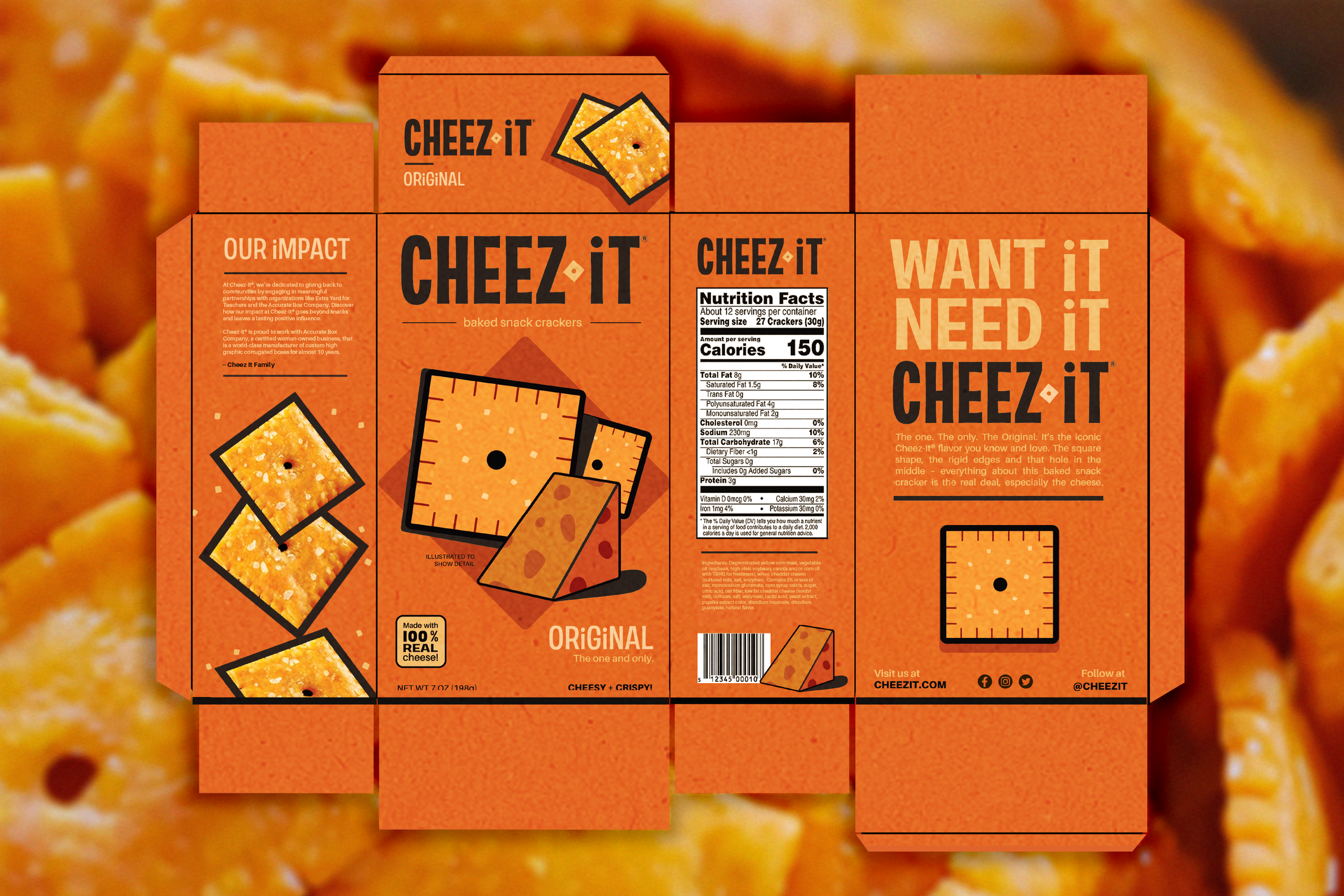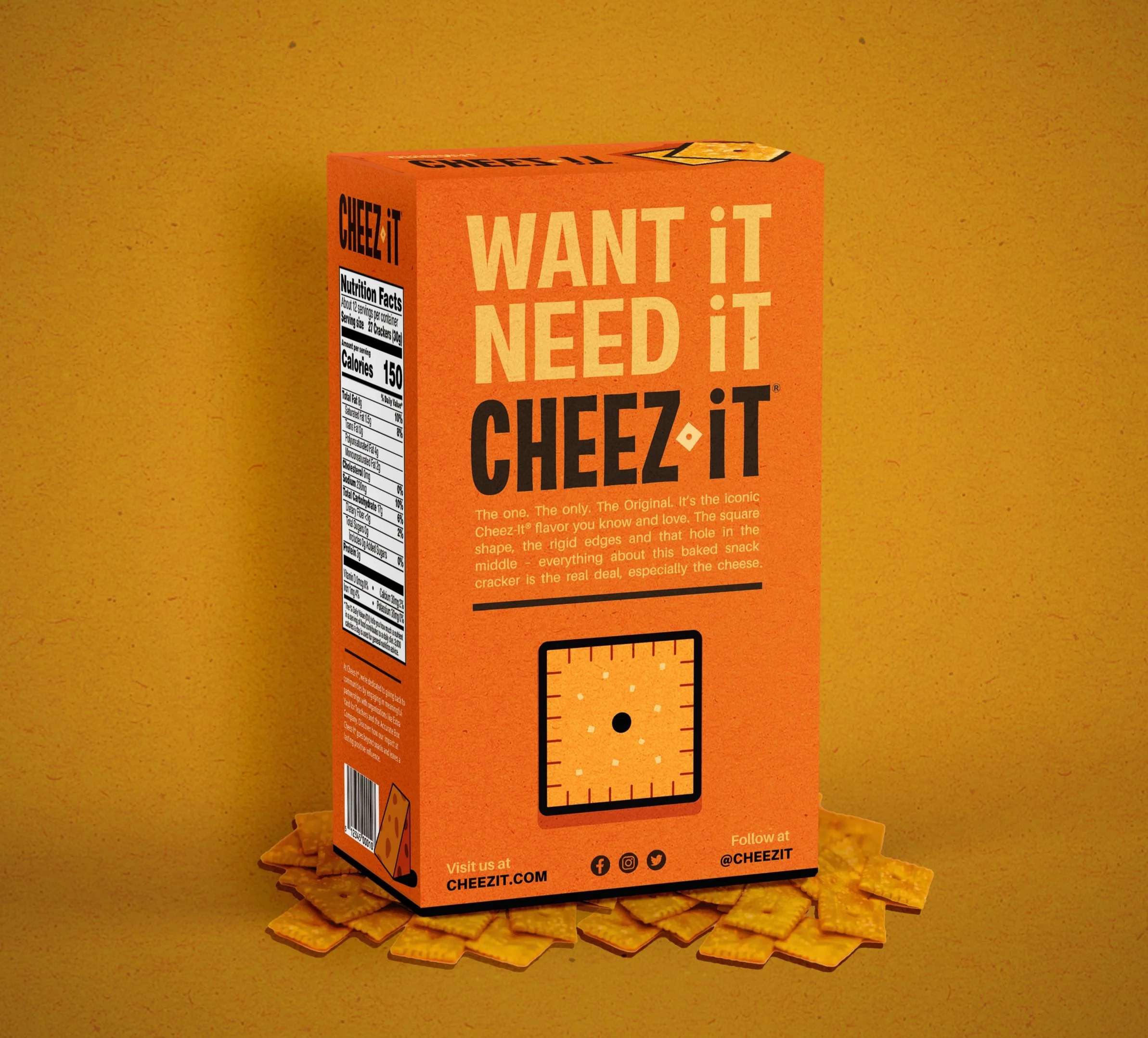
Sharp Angles, Even Sharper Branding
The idea: For a snack built on intense flavor and the "Want It. Need It." slogan, the traditional packaging felt a bit too safe and corporate. To better reflect the bold, cheesy nature of the product, the visual identity needed to move away from cluttered layouts and toward a cleaner, more vibrant aesthetic that captures attention without losing the product's famous identity.
The Evolution: The solution was to elevate the brand’s most recognizable asset, its yummy orange color, into a primary driving force. I created a hybrid look that feels both professional and polished. This shifts the focus back to the "real cheese" roots while giving the brand a fresh, multi-dimensional presence that stands out in any grocery aisle.
PACKAGE DESIGN \ LOGO DESIGN
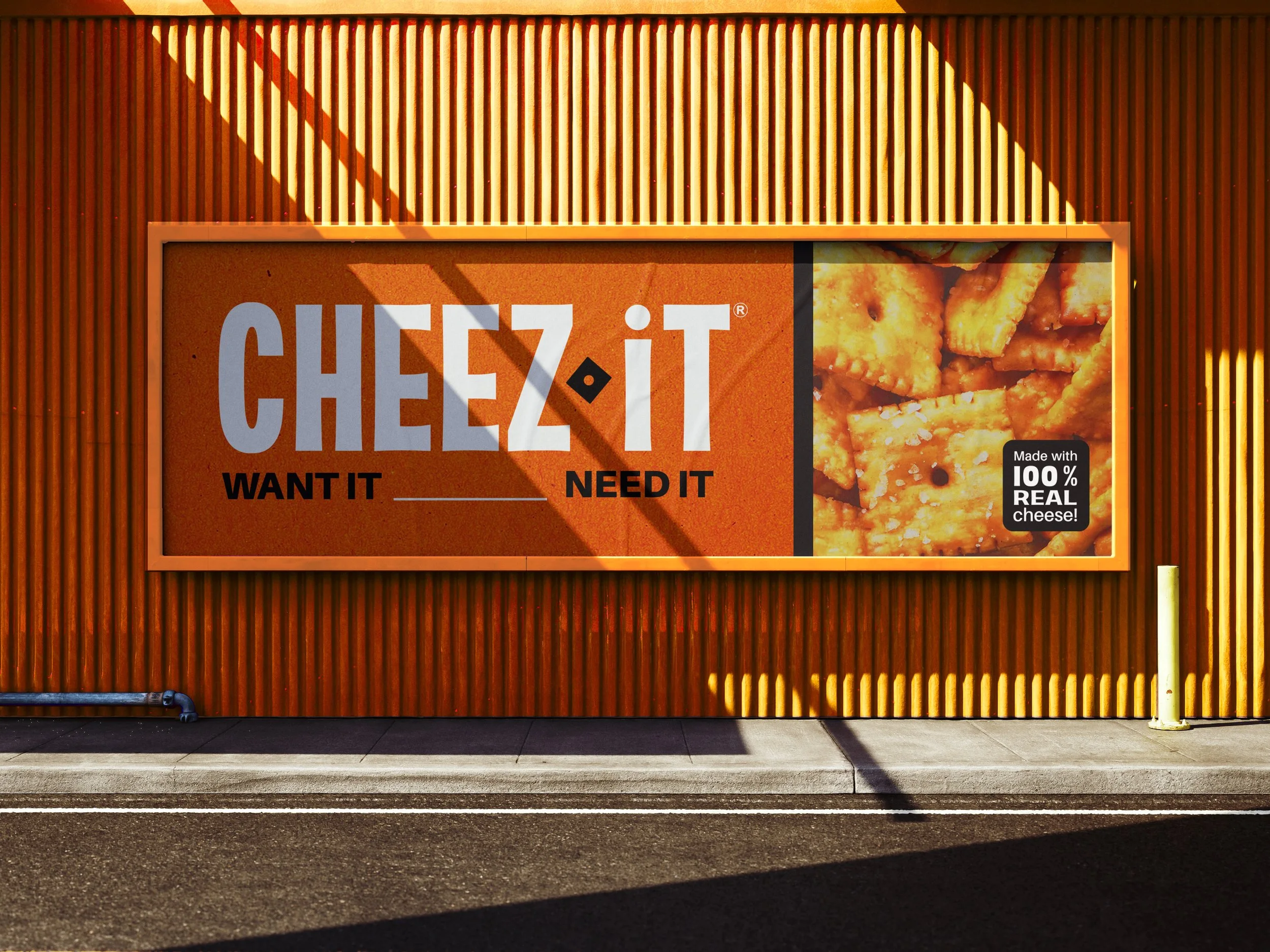
AD DESIGN